10 Outstanding Website Navigation Menus
Website navigation and website design are both the most important aspects of a website.
A navigation menu can either make or break a particular website. So, it’s critical to handle it with utmost care. One should focus on designing it with passion. But now the main question that arises is what leads to an outstanding main menu?
The best way to understand and learn this thing is by example. So, here we have compiled a fantastic list of navigation menus from all around the internet.
They vary from quite basic to highly intricate ones, but what matters is that they all perfectly suit the design and atmosphere of the website.
Now, let’s get started with our discussion.
Unsplash
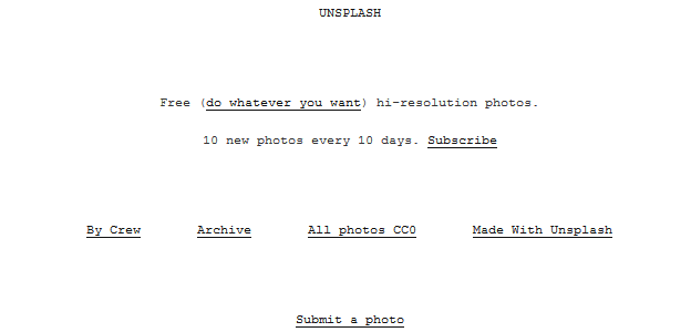
It is an outstanding example of the main menu. Unsplash is all about displaying incredible photos without any sorts of distractions.
To complement the overall feeling of the website, they employ a minimalist design along with a lot of white space. So, you can try something like this for your website.
Edinburgh Zoo
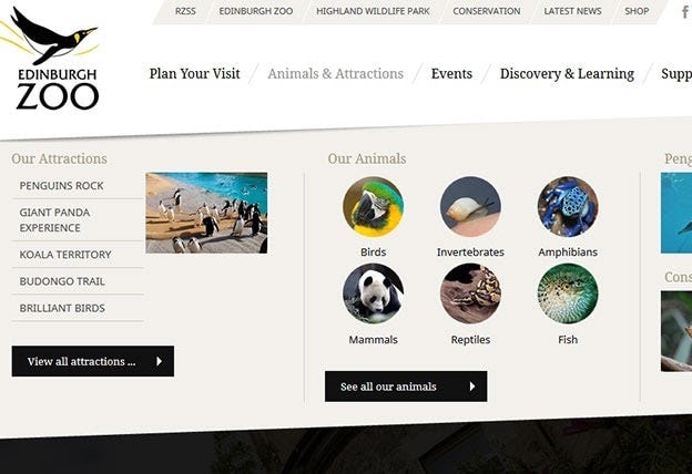
The website of Edinburgh Zoo is a good example of how to build navigation with a lot of submenus. Starting at the top, we have an all-caps, sans-serif font on top of a skewed beige backdrop. It features menu items which are considered to be less significant.
Below that, you will find the availability of a basic menu that makes use of a serif font that is divided into important categories.
Each of these expands into a sleek-looking drop-down when hovered over. If you are looking for a similar design for your website, then all that you need is to opt for the assistance of a professional website designing agency in USA. They will be able to design as per your particular project needs.
Light & Shadows
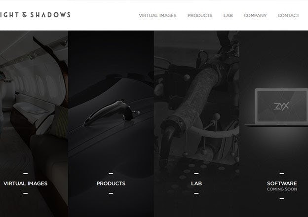
This menu is also basic, but it possesses some great details. The sans-serif typeface at the top is in all capitals, yet it emanates elegance owing to its small size as well as faded light grey tone.
In addition, the items in the hero area are doubled, making the main menu less significant in the overall website structure.
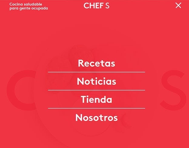
CHEF S
The menu in the case of CHEF S is buried in the upper-right corner, but whenever you click on it, it expands to fill the full screen.
Also Read: [How To Design A Website In 2022 – Complete Guide]
A semi-opaque backdrop as well as elegant sans-serif font balances out the in-your-face impact. You would be able to create a similar design by opting for the help of a company that provides the latest menu design development services.
Scotch & Soda
By having a close look at the main menu, you would be able to tell what your website is all about. It is a fashion website which is easily reflected in its main menu.
This is an example of a classic navigation menu that is still in fashion and is mostly utilized all through upscale fashion. It makes use of a serif typeface with all capital fonts, wide proportions, and ample spacing.
The contrast is set to its highest setting: white on black. All of these elements contribute to making this niche very easy to recognize even before you have explored the website.
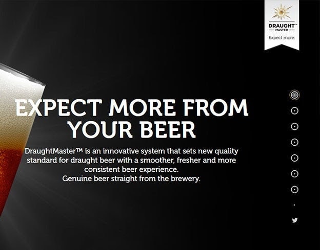
Draught Master
This particular website tends to have an unusual approach to its navigation system. The menu items aren’t visible until you hover over them. While this is not optimal for a majority of websites, but it works well for them. Once you visit this website, you will find this to be appealing.
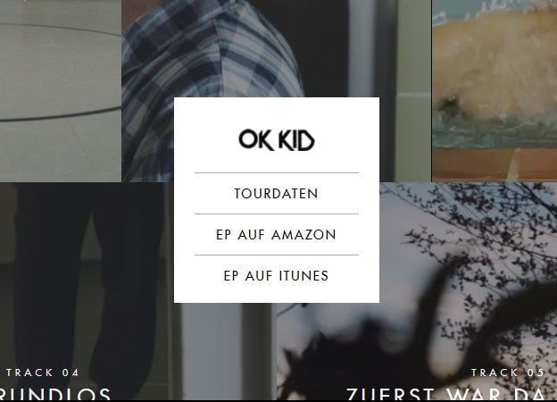
OK Kid
This can be called a contemporary navigation menu. It is located in the middle portion of the website’s grid. Also, this website looks very minimal with active videos as well as links scattered around it.
Whenever you hover over specifically the central navigation, you’ll see that the typeface, as well as the overall design, does not look great. However, if you hover over the surrounding links, you will get an interactive experience of animated text, interesting videos, and crescendoing music.
The central navigation does not have to brag; it’s just there to do its function. All in all, this website tends to adopt a very unique approach.
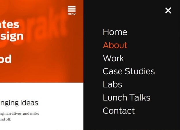
Hyperakt
This navigation system is heavily influenced by apps. It’s concealed behind a menu icon in the top right corner of the screen, which expands to the right of it whenever you consider clicking on it.
It’s appealing in every aspect as it adheres to the fundamental guidelines of every menu i.e., good contrast, clear text, enough space, and ease of use. Although the fact that it is concealed will not appeal to everyone, we may overlook this due to its appearance.
Hunger Games Exclusive
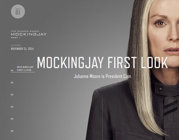
On the left side of the screen, this website possesses a very stylish vertical menu. You don’t get to view all of the menu items at once, so you’ll have to navigate the site to discover what you’re looking for.
The inclusion of numbers aids in the process of navigation, and the fact that you can scroll through each “page” improves its overall usability.
Again, not the sort of menu you’d want for every website, but it’s perfect for this type of content.
Belgacom
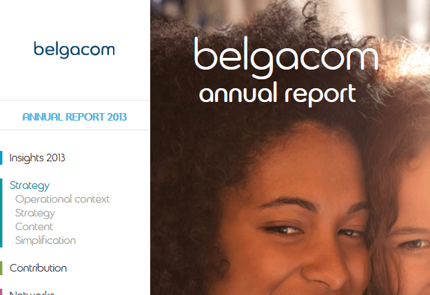
Colors are used to distinguish each category in this classic vertical menu. It is a wonderful example of how color can be used to visually guide a user. Vertical menus have lost serious ground over the years, but menus like Belgacom’s prove that they’re still fighting.


