Web Development

Introduction

When I first started writing CSS code, I was perplexed by the numerous units used for font size, and I had no idea when, how, or why to utilize particular font units. Following some research, I’ve come up with several units that we may utilize in our projects.

CSS properties like padding, margin, height, width, and so on make use of measurements. In this case, the units of measurement are px, em, rem, and VW.

What are CSS Units and Values?

To provide valid values for CSS blocks or functions. CSS values include integer and real numbers, colours, strings, URLs, percentage values, time, angles, and so forth.

What is a CSS Unit?

The CSS unit specifies the size of content or elements. Suppose you wish to change the size of an element, such as a heading.

You must specify a value for the heading, such as font-size or line-height, correct? Let’s look at an example.

h2{
font-size: 22px
margin-top:2em;
Margin-bottom: 1.5em;
}

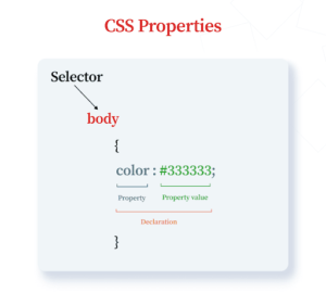
In the above example, font size and margin are property, and 22px, 2em and 1.5em are units.

Consult Web Developers

Relative vs. Absolute Units

When deciding which units to employ, it’s vital to remember that there are two types of units:

Relative
Absolute

Relative Units:

Relative Units are used for responsive layout. Relative units depend on viewport or parent values, where they can be relative to another property.

Consider an example: if the screen size is large relative units are scaled to large values same as if the screen size is small relative units will be set according to small screen size.

Relative Units are tabulated as follows:

Em It will inherit the value from the parent element. Consider if We’ve defined a Div element with a font size of 16px then it will be rendered as 1.6em. Consider the following pen as an example.
em value * Font Size = Result Unit in pixel
1.6 * 16 = 25.6px
Ex It will inherit the x-height value from the parent element. So here x is mentioned by x-height value.
Ch It will inherit only the width value from the parent element. It measures the width of the Integer value “0”.
rem A relative font size of the Root, that’s why it’s called rem = Root Element. Now We understand how it works. Suppose root element size of 16px then rem value will be 1rem.
rem value * root value = Result unit
2 * 16 = 32px
Vh It’s relative to the height of the viewport or window.
1vh = 1% or 1/100 of the viewport height.
Vw It’s relative to the width of the viewport or window.
1vw = 1% or 1/100 of the viewport width.
Vmin It’s relative to the smaller dimension of the viewport
1vmin = 1% or 1/100 of the viewport’s smaller dimension.
Vmax It’s relative to the max dimension of the viewport
1vmax = 1% or 1/100 of the viewport’s maximum dimension.
Percentage(%) It’s considered the percentage value of the parent or relative to another value. Suppose if there is a div of 1000px if you give a percentage value to the inner div then output will be 10px.

Absolute Units:

Absolute units are the same size regardless of parent element or window size. This means that a property set with an absolute unit value will be that size when viewed on a phone or a huge display (and anything in between!).

When working on a project where timeliness is not a factor, absolute units can be advantageous. Desktop software, for example, that cannot be resized, can be designed for the preset dimensions. You don’t need the content to scale if the window doesn’t.

Absolute units are also referred to as fixed value units. The value of units is not relative to anything; it is considered as it is. As a result, Absolute Units are not as responsive as Relative Units.

Absolute Units are listed in the following order:

Unit Name Description Example
px Pixels It’s used for measurement in Pixels.
1/96 of 1 inch (96px = 1 inch)
font-size:12px;
in Inches It’s used for measurement in Inch font-size: 0.2in;
pt Points It’s used for measurement in Points.
1/72 of 1 inch (72pt = 1 inch)
font-size:12pt;
pc Picas It’s used for measurement in Picas.
12pt = 1pc
font-size:1.2pc;
cm Centimeters It’s used for measurement in Centimeters. font-size:1cm;
mm Millimeters It’s used for measurement in Millimeters.
10 mm = 1 cm
Font-size: 1mm

Hire Dedicated Skilled Developer

Wrapping up

Knowing all of the tools and possibilities accessible to create a high-quality frontend project with CSS measurement units is incredibly beneficial.

It’s rare that you’ll need to employ all of them in the same project. The necessity to employ some of them is improbable on its own. However, certain challenges necessitate imaginative solutions, and sometimes turning to one of these lesser-known units can be the key.

Developers are problem solvers, thus the more resources they have at their disposal, the better professionals they will become.

If you are looking to hire web developers that can solve all your tech woes, consider us. Bytes Technolab Inc. is a leading Web development company in USA that can take care of all your needs.

Related Blogs

How Agile Product Engineering is Revolutionizing Software Development

How Agile Product Engineering is Revolutionizing Software Development

Times are changing, and so are modern businesses. Frequent and evolving changes in market trends or demands have forced organizations to rethink...

Data-Driven Digital Transformation: A Roadmap for Success

Data-Driven Digital Transformation: A Roadmap for Success

Digital transformation is no longer a luxury; it is a dire need for businesses operating in all industries to grow. It lies at the heart of the ...