Web Development

Introduction

Keyframe animations in CSS are fantastic. We can utilize them for a variety of cool things because they are one of CSS’s most potent and useful tools.

They have some peculiarities, and utilizing them might be very frustrating if you don’t grasp those peculiarities.

We’re delving deeply into CSS keyframes in this course. We’ll figure out how they operate and see how to use them to create some really important animations.

A CSS keyframe animation’s main goal is to interpolate between various CSS snippets.

Here, for instance, we build a keyframe animation that would gradually increase the horizontal position of an element from 0% to 100%:

/* Create the keyframes animation */

@keyframes slide-horizontal {

from {

transform: translateX(0%);

}

to {

transform: translateX(100%);

}

}

/* Apply created keyframes with HTML element */

.element {

animation: slide-horizontal 2000ms;

}

Animation needs a duration, just like the transition property does. The animation should last 2 seconds (2000ms), as stated in this sentence.

The declarations contained in our “from” and “to” blocks will be interpolated by the browser over the given time period.

Transition timing functions in CSS

For our keyframe animations, we have access to the same set of timing routines. And “ease” is the default value with the “transition”.

The “animation-timing-function” property allows us to modify it:

/* linear is only single timing value */

animation-timing-function: linear;

Linear: Animations that follow a linear path progress continuously from beginning to end. Since the animation moves along at the same speed from beginning to end, there are no variations in the timing behavior.

Ease: Animations with this timing function start slowly, speed up, and slow down as they reach the end of the animation cycle. By default, the animation-timing function is set to ease if not specified by the developer.

Ease-in: Animations with Ease-in start slowly and speed up until the animation cycle is complete.

Ease-out: Ease-out does the opposite, starting quickly and slowing down until the animation is completed.

Ease-in-out: This timing function starts slowly, speeds up, and ends slowly. It sounds similar to ease, but here is the difference; unlike ease, ease-in-out has the same speed during the starting and ending stages, unlike ease where the speed towards the end of the animation is not uniform with the speed at the beginning.

Infinite: In order to play CSS animations indefinitely, all you have to do is set the animation-iteration-count property to infinite.

Alternate: The animation goes from 0% to 100% and 0% again.

Alternate-reverse: The animation goes from 100% to 0% and 100% again.

Forwards: The last keyframe styles are retained and applied to the element. The last played keyframe depends on the “animation-direction” and the “animation-iteration-count”.

Horizontal movement

We can make the animation horizontally with the help of CSS property, without using any third-party libraries or additional JavaScript code.

Here, we will use the CSS animation property with the help of an infinite timing function with some delay interval.

We’ll step-by-step construct our CSS animation sequence in the sections.

Here we’ll split the CSS animation sequence into two sections:

1. Element Stylesheet

2. Element Animation

image1

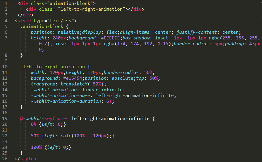
Let’s start here with the “Element Stylesheet” in the above given example. We have used a class named “.left-to-right-animation” as a style element in which we have added properties related to animation like animation, animation-name, animation-duration.

animation: It’s a style of animation like how animation behaves throughout the animation period. Here we have mentioned linear animation and it works infinitely.

animation-name: It’s a name of animation in which we have to mention the animation name that we have designed using @keyframe.

animation-duration: Animation duration defines how long the animation will take to perform its cycle.

Here we have added separate animation properties to demonstrate the different properties of animation, you can find below an example of how we can combine the animation property into a single and add values together.

Now what is “Element Animation”?

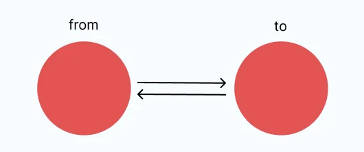
Here you can see in the above example that we have added @keyframe named “left-right-animation-infinite” as a main element animation in which we have mentioned how the horizontal movement works starting from 0% to 50% to 100%.

image2

Vertical movement

Also, we can make the animation vertically with the help of CSS property.

Here, we will use the CSS animation property with the help of an infinite timing function with some delay interval.

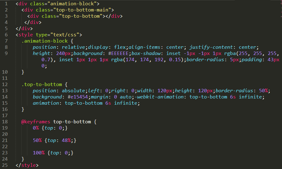
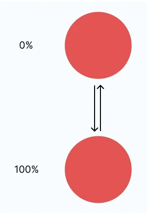
We’ll animate the circle shape to move vertically in this part.

image3

Here in the above example, you can see only one property for the animation which is “animation” and inside that we have mentioned animation-name and animation-duration.

image4

Opacity effect

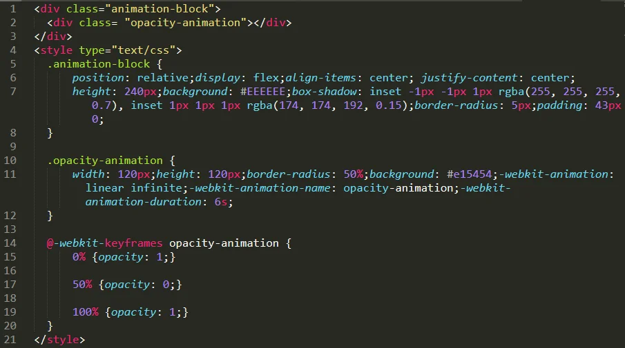
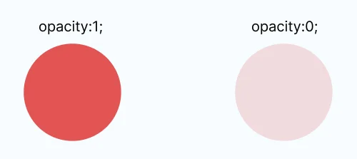
Using the “opacity” property, we will animate the element opacity between “1” to “0” to “1” with an infinite loop.

image5

image6

Background color change

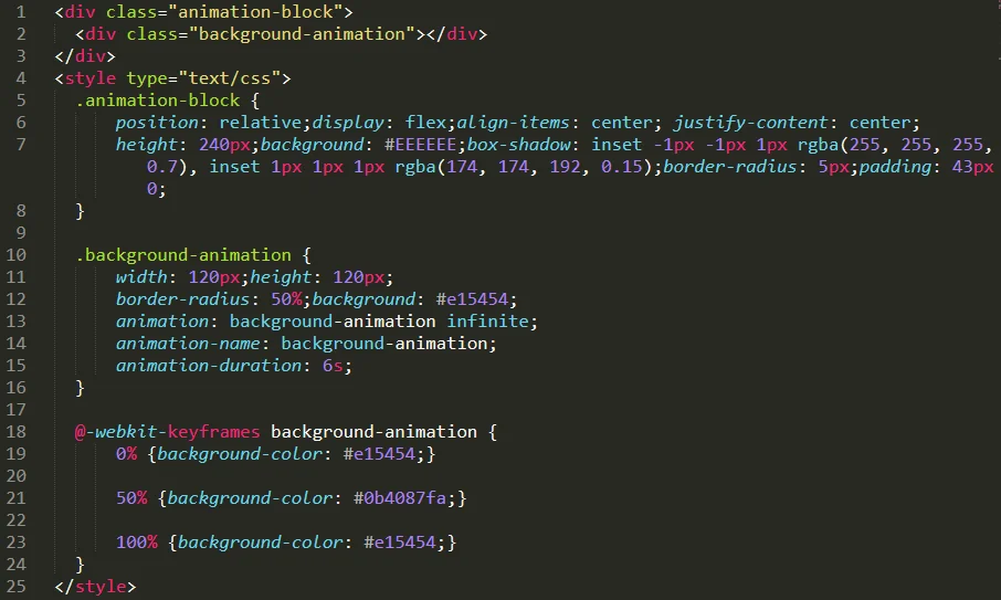
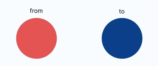
Using the “background-color” property, we will animate the element background color with the different colors in an infinite loop.

image7

image8

Transform property animation

Rotate Animation

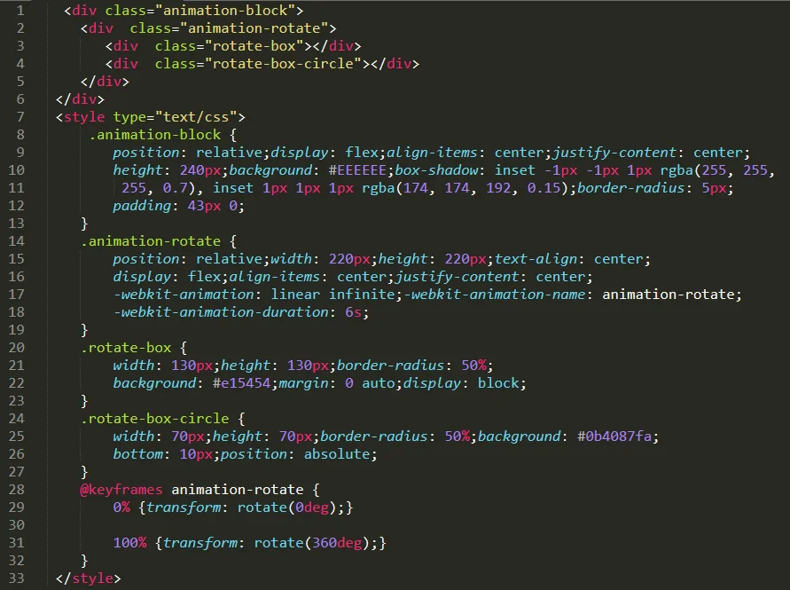
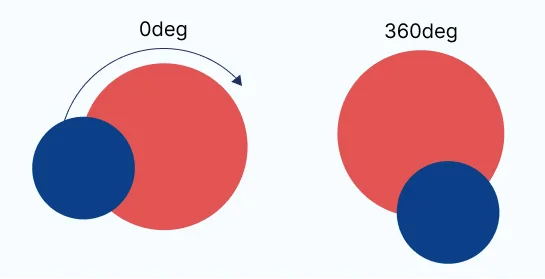
In this illustration, we’ve used the transform attribute in conjunction with the keyframes to produce a rotating loading spinner.

image9

image10

Scale Animation

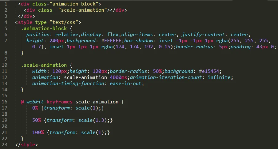
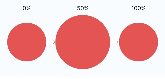
In this illustration, we’ve used the scale attribute in conjunction with the keyframes to produce an element of “scaling”.

image11

image12

Multistep loading Spinners

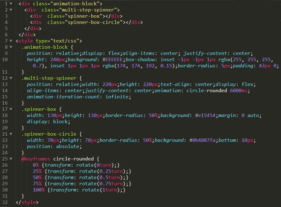
In this playground, it takes both spinners two seconds to complete one full rotation. However, the multi-step-spin divides it into 4 separate steps, each of which is applied with the timing function.

image13

image14

Matrix animation

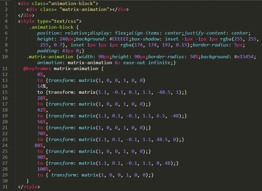
This is where things get interesting, but also more efficient in the right situation. If you are doing a lot of transformations and don’t want to write them all individually,  it can be combined with the matrix() method.

Here is a basic parameter to follow:

transform: matrix( scaleX(), skewY(), skewX(), scaleY(), translateX(), translateY() );

image15

image16

scaleX(): Any element can be resized “horizontally” along the x-axis by using the scaleX() CSS method.

scaleY(): Any element can be resized “vertically” along the y-axis by using the scaleY() CSS method.

skewX(): The CSS function skewX() describes a transformation that skews an element horizontally on a 2D plane.

skewY(): The CSS function skewY() describes a transformation that skews an element vertically on a 2D plane.

translateX(): Any element can be moved position “horizontally” along the x-axis by using the translateX() CSS method.

translateY(): Any element can be moved position “vertically” along the y-axis by using the translateY() CSS method.

Transform static web pages into immersive experiences!

Explore the art of keyframe animation now and bring your ideas to life. Elevate your web design game—start creating stunning animations today! Call our HTML experts now!

Reference URL:

@keyframes

transform-function

transform

Related Blogs

AI-Powered Medical Imaging: Bringing Precision Healthcare into the Future

AI-Powered Medical Imaging: Bringing Precision Healthcare into the Future

Many new healthcare advances will arise when artificial intelligence and medical imaging combine. The aspect that changes is as immense as the s...

Selecting the Best Adobe Experience Manager Solution for Your Needs

Selecting the Best Adobe Experience Manager Solution for Your Needs

Creating and managing engaging content across various platforms is important for eCommerce stores in this ever-evolving digital commerce era. Th...

How Adobe Commerce Development Partner Boosts Your eCommerce Success?

How Adobe Commerce Development Partner Boosts Your eCommerce Success?

Modern retail owners have turned to accredited eCommerce development companies as their technical consulting and implementation partners. By han...