Mobile App Development

Introduction

In this article, I’ll demonstrate the ease of crafting email templates that appear fantastic on all types of screens.

When building email templates, it’s imperative to use inline CSS rather than external stylesheets. Your email will render properly on all email clients thanks to inline CSS.

Because most consumers read emails on mobile devices, employ a mobile-first approach when creating your email template. Make sure your email template responds to different screen widths by using responsive design techniques like fluid layouts, scalable images, and media queries, and optimize your photographs to cut down on file size and hasten the loading of your website.

Why Do We Use Responsive Email Templates?

Our emails are optimized for viewing on many platforms, such as desktops, laptops, tablets, and smartphones, thanks to the usage of responsive email templates. A responsive email template will scale its photos, fonts, and layout to fit the screen size of the device being used to view the email.

Without a responsive email template, emails may appear distorted or challenging to read on smaller displays, which could have a negative impact on the user experience and reduce interaction with the email’s content. Furthermore, a lot of email clients and webmail services give responsive emails the upper hand over non-responsive emails, which can improve your emails’ deliverability and open rates.

In conclusion, employing a responsive email template is a crucial best practice for email marketing since it guarantees that your emails are aesthetically pleasing, simple to read, and available on all devices.

What Are The Supporting Platforms of Responsive Email Templates?

Numerous platforms enable responsive email templates.

1) Email clients:

Some of the email clients that can be used include Gmail, Yahoo! Mail, Outlook, Thunderbird, Apple Mail, and various others. Each of these email clients uses a different rendering engine, so you must test your responsive email design on each one.

2) Email service providers:

HubSpot, Zoho Mail, Sendinblue, AWeber, Campaign Monitor, Mailchimp, and Constant Contact.

These companies provide resources for creating and distributing responsive email campaigns.

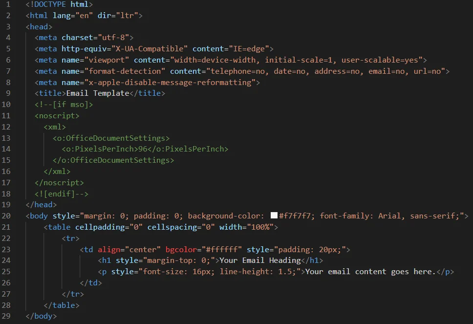
Email Template Skeleton

image1

As shown in the basic email template HTML structure you have to maintain the table tr structure, and it’s preferable. Also, you have to take note that in many modern email clients that support media queries, there are still some email clients that don’t support them.

For example, some versions of Microsoft Outlook (particularly those that use the Word rendering engine) do not support media queries. Also, CSS properties like position, float, overflow, filter, and transform will not work or may be problematic in responsive email templates.

Also If you want to understand why each part of the code is there, keep reading and I’ll explain it in more detail. And give you more information about basic email template HTML structure.

Document Type (Doctype)

Using an HTML5 Doctype is recommended, but keep in mind that not all email clients will respect it. There may be small rendering differences between HTML4 and HTML5, such as setting a <td> to display: block in HTML4.

HTML Element

Define your document in HTML format with the <html> tag. Use lang=”en” to set the content language to English and dir=”ltr” to indicate left-to-right direction.

Meta Charset

Set the character encoding standard with this element. utf-8 is the recommended option to cover almost all characters and symbols. Keep in mind that email headers may override this setting.

Meta http-equiv

This element tells the browser which version of IE to render with, although it may not apply to all email clients. It can also enable media queries on some versions of Windows Phone.

Meta Viewport

Use this element to control the page’s dimensions and scaling. width=device-width sets the width to follow the device’s The screen width determines the size of the display, while the initial-scale=1.0 parameter establishes the initial zoom level. User-scalable= yes allows the user to adjust the scale.

Meta Format-Detection

Although support is low, including these elements can prevent email clients from automatically detecting and generating links from phone numbers, dates, addresses, email addresses, and URLs.

Meta X-Apple-Disable-Message-Reformatting

This element is specific to Apple and prevents their iOS email client from displaying responsive emails at half the width of the screen and zoomed out.

Meta Title

Give your document a title with this element, which will be seen in the browser tab if a user views the email in a browser. It may also show in previews for some email clients.

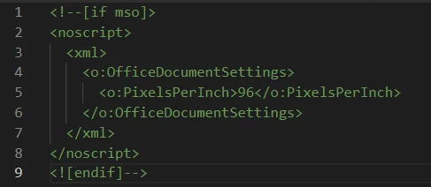
Use <!–[if mso]> script: The purpose of this code is to aid in rendering on desktop versions of Outlook for Windows.

image2

<!–[if mso]> <![endif]–>

The if statement included in this code ensures that it is exclusively visible to desktop versions of Outlook for Windows, while still being rendered by T-online.

<noscript>

Stop the text 96 showing in T-Online.

<o:PixelsPerInch>96</o:PixelsPerInch> 

This can enhance the display quality on devices with higher DPI settings, which is frequently observed on Windows laptops equipped with monitors of greater than typical resolutions or for users who have intentionally raised the DPI settings.

image3

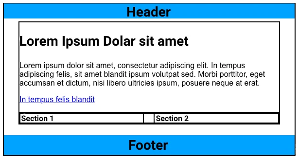
Here is a simple example of email structure, as shown in the image, Header and Footer parts have to be in the center or left aligned. You can see every section is left aligned, there is a major reason behind this type of directional alignment design.

The reason is when you design like this, you don’t have to worry about the responsiveness of this design. You can wrap every section easily one by one so it is the best way to reduce responsive work. So always design all sections in a left-aligned design.

So let’s start with the Header part.

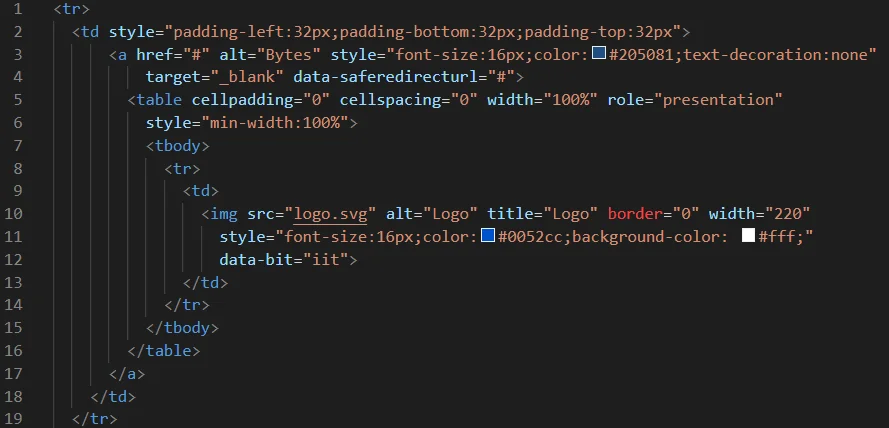
Basic Email Template Header Part

image4

The logo is an essential part of a brand’s identity, and including it in the email template can help reinforce brand recognition.

Also, make sure the logo is responsive, meaning it can adapt to different screen sizes and resolutions.

image6

image7

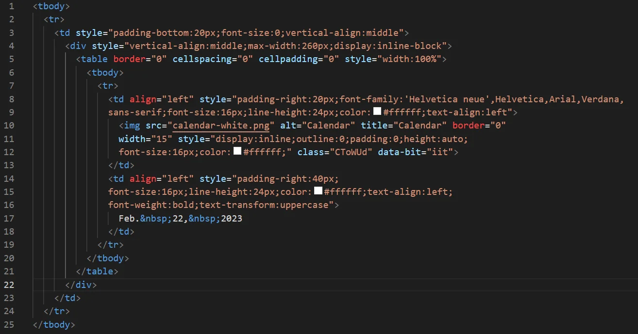
To set up Left/Right sections in a table row for a mail template, you need to use the “<td>” element to define the individual cells in the row.

Also, inside the “<tr>” element, you need to include two “<td>” elements, one for the left section and one for the right section.

Basic Email Template Banner Structure

image9

image9

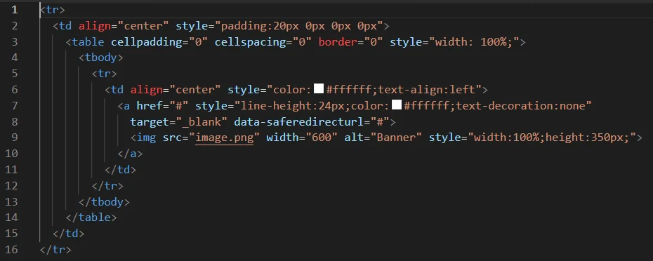
We take all the new sections in separate <tr> so now for the banner we need to create one <td> with a new <table> structure inside it as given in the above code. So basically that new table has also one <td> which has a banner image inside it. And that’s how our one <td> table structure for the banner is coded.

Basic Email Template Listing Structure

Use image formats that are supported by email clients such as JPG, PNG, or GIF. Avoid using large file sizes and use compressors to reduce file sizes. Also, use descriptive file names and alt tags to describe the image and use height and width for image resolution. This helps improve the image’s SEO and accessibility.

image10

image11

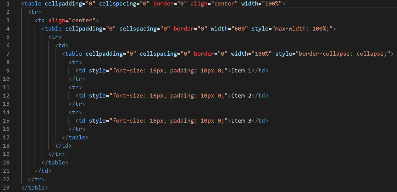
In a responsive email template, the <table> and <tr> elements are important for creating a structured layout that can adapt to different screen sizes and device types. Using <table> and <tr> elements allows for the creation of rows and columns that can be easily adjusted and reorganized based on the available screen space. This is particularly important for responsive emails, where the layout needs to adapt to Include mobile devices, which feature varying screen sizes.

image12

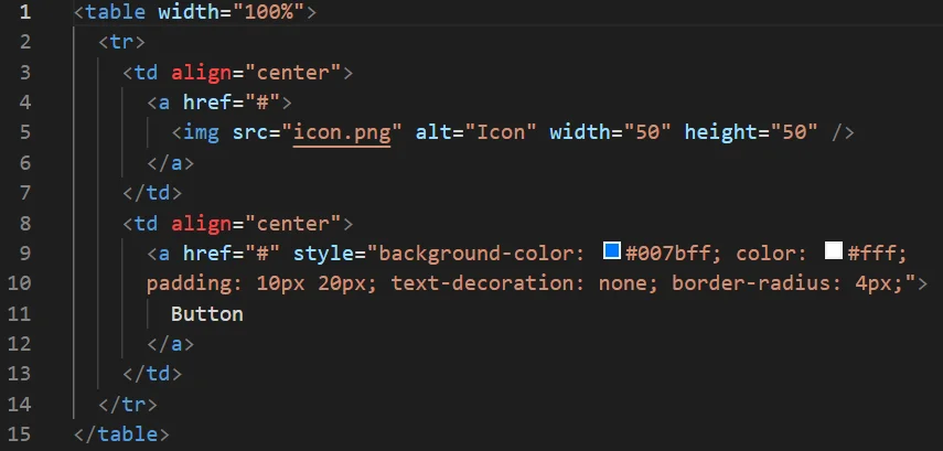
Icons and buttons can make your email more visually appealing and engaging. Also, buttons can be used to guide the reader to take an engaging in a specific action, such as accessing a website or installing an application. Always insert the icon using the <img> tag and Add a button using the <a> tag.

Basic Structure of Icons or Buttons

image13

image14

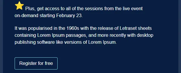
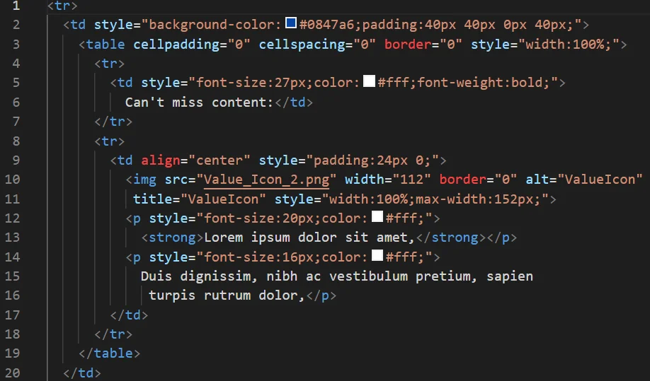
The image with text section is an essential component of a responsive email template as it helps to break up long blocks of text and makes the email visually appealing. Images can capture the reader’s attention, convey information quickly, and provide context to the text. By combining images with text, email designers can create a balanced layout that draws the reader’s eye to the most important parts of the email.

Basic Structure of Image Text Section

image15

image16

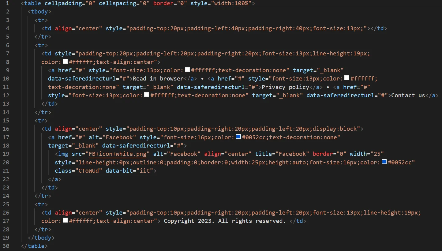
Footer, footer links, social media icons, and copyright are important in responsive email templates. The footer provides a place for important links and other relevant pages that users may want to access. Including social media icons in the footer allows users to follow your brand Across diverse platforms, effectively enhancing brand recognition and interaction. Including a copyright notice in the footer adds legitimacy to your email and shows that you take your brand seriously.


Basic Structure of Footer with Social Icons and Copyright Section

image17

To gain more in-depth insights into the composition of responsive email templates, you can explore this link for additional information.

Link: https://codepen.io/rishabhpatelbytes/pen/ZEMqPWy

Hire Mobile App Developers

Complexity in Supporting Platforms of Responsive Email Template

When it comes to implementing support for responsive email templates on a platform, there are numerous complex challenges to address. Some of these challenges include:

1) Email clients: One of the biggest challenges is the diversity of email clients, each with its own rendering engine and capabilities. Some popular email clients, such as Gmail, Outlook, and Apple Mail, may have different limitations and display issues, making it difficult to create a consistent experience across all clients.

2) Screen sizes: Responsive email templates must be optimized for a range of screen sizes, from desktop to mobile devices. This requires careful planning and testing to ensure that the email looks good and functions properly on all screen sizes.

3) Code limitations: Email clients have strict HTML and CSS limitations, which can make it difficult to implement advanced design elements or interactive features.

4) Email service providers: Email service providers may impose their own restrictions on the use of certain design elements or coding techniques.

5) Accessibility: Ensuring that email templates are accessible to all users, including those with disabilities, requires additional design considerations and testing.

6) Testing: It is essential to thoroughly test email templates on a range of devices and email clients to identify and resolve any issues before sending them to subscribers.

Some HTML, and CSS Properties That do not Support Email Design

HTML:

-HTML5

-HTML form elements (e.g. radio buttons, checkboxes)

CSS:

-Floats

-Positioning properties (e.g. position: absolute, position: fixed)

-Background images

-Font styles (e.g. font-variant, font-stretch)

-Media queries

-Flexbox

-Grid

-Animations

-Transforms

-Filters

-External stylesheets

Point to be noted that JavaScript is not supported on all Platforms

Some Specific CSS Properties Which do not Support in Outlook

here is a comprehensive list of some CSS properties that may not be fully supported in Outlook but are supported in Gmail:

Border-radius

Box-shadow

Web fonts

Padding and margin on table cells

Transitions and animations

CSS gradients

display: flex

display: grid

Max-width

Overflow

Object-fit

Font-face

Letter-spacing

Text-shadow

Text-transform

Text-decoration

Opacity

Filter

Cursor

Outline

Some platforms like Outlook have limited support for vendor-prefixed CSS properties, and the level of support can vary depending on the version of Outlook being used. In general, it’s best to use vendor prefixes sparingly and only when necessary.

Border-radius:

-webkit-border-radius: 10px;

-moz-border-radius: 10px;

border-radius: 10px;

Box-shadow:

-webkit-box-shadow: 5px 5px 5px #FEFEFE;

-moz-box-shadow: 5px 5px 5px #FEFEFE;

box-shadow: 5px 5px 5px #FEFEFE;

Text-shadow:

-webkit-text-shadow: 2px 2px 2px #FEFEFE;

-moz-text-shadow: 2px 2px 2px #FEFEFE;

text-shadow: 2px 2px 2px #FEFEFE;

Gradient background:

background: #ffffff; /fallback color/

background: -webkit-linear-gradient(#ffffff, #cccccc);

background: -moz-linear-gradient(#ffffff, #cccccc);

background: -o-linear-gradient(#ffffff, #cccccc);

background: linear-gradient(#ffffff, #cccccc);

Transform:

-webkit-transform: rotate(45deg);

-moz-transform: rotate(45deg);

transform: rotate(45deg);

Transition:

-webkit-transition: all 0.3s ease-in-out;

-moz-transition: all 0.3s ease-in-out;

transition: all 0.3s ease-in-out;

Steps to Make Sure that your Email Template Works in Outlook as well as Gmail

1) Use web-safe fonts: As mentioned earlier, web-safe fonts are the safest option for email templates as they are widely supported by most email clients, including Outlook. If you are using custom fonts, make sure to test them thoroughly in Outlook to ensure that they are displaying correctly.

2) Avoid complex CSS: Some CSS properties may not be fully supported in Outlook, so it’s important to keep your CSS code simple and avoid using complex layouts or effects. Stick to basic HTML and CSS that are supported by most email clients.

3) Use inline styles: Outlook may strip out CSS styles from the head section of your email template, so it’s important to use inline styles instead. This means placing all of your CSS code directly in the HTML tags using the style attribute.

4) Test your email template: Lastly, it is crucial to conduct comprehensive testing of your email template across various email clients, encompassing different iterations of Outlook. Use an email testing tool or send test emails to yourself to ensure that your email template looks and functions correctly on all email clients.

What Differentiates a Responsive Email from an Adaptable Email?

A responsive email shrinks in accordance with the screen size. While the email layout will be consistent across platforms, the text or image will resize itself to fit the screen. One drawback is that, if the arrangement doesn’t change, the font can get too small, making it challenging for mobile users to read.

A responsive email, in contrast, recognizes the width of the screen and adjusts its size accordingly. To make sure that the information fits the device while remaining readable, the email design may alter, such as from a two-column layout on a laptop to a single-column format on a mobile device.

How Can We Use Custom Fonts in Responsive Email templates?

Using custom fonts in email templates can be a bit tricky because not all email clients support custom fonts, and those that do support them may do so in different ways. Here are a few options for using custom fonts in email templates:

1) Web-safe fonts: One way to ensure that your email template looks consistent across different email clients is to use web-safe fonts, which are fonts that are commonly found on most operating systems and web browsers. Examples of web-safe fonts include Arial, Verdana, Georgia, and Times New Roman. These fonts are more likely to be displayed correctly across different email clients because they don’t require any additional setup.

2) Hosted web fonts: Another option is to use hosted web fonts, which are fonts that are served by a third-party font service such as Google Fonts or Adobe Fonts. You can use the @import rule in your CSS code to link to the hosted font, like this:

image18

However, note that some email clients may block external fonts or require additional setup to display them correctly.

3) Embedded fonts: Finally, you can embed fonts directly into your email template using base64 encoding. To accomplish this, you convert the font file into a base64-encoded string and seamlessly incorporate it within your CSS code. Here’s an illustrative example:

image19

Note that embedding fonts in this way can make your CSS code longer and more complex, and may cause compatibility issues with some email clients. To ensure the desired appearance and functionality, it is highly recommended to thoroughly test your email templates across various email clients.

Use spacer image to give left-right spacing in responsive email template

A spacer image is an image that is used to create empty space in an email template. It is a widely employed method to introduce spacing between various elements within an email.

To use a spacer image, you can follow these steps:

1) Create a small transparent image, such as a 1×1 pixel transparent GIF or PNG.

2) Set the width and height of the image to the desired amount of space you want to create in your email template. For example, if you want to create a space of 20 pixels, you can set the width and height of the image to 20 pixels.

3) Insert the spacer image in your email template using the <img> tag, and set the src attribute to the URL of the transparent image.

4) Apply any additional styling you want to the spacer image using CSS, such as setting the display property to block to make it behave like a block-level element.

How Useful Emails Can Be For Your Company

1) Enhance the user experience: A well-designed email template provides a consistent look and feel for your brand across all your email communications. This helps establish brand recognition and build trust with your subscribers.

2) Readable Content: Users will have a better overall experience when you employ responsive design in your email marketing since they can read your content without having to squint, squeeze, or zoom.

3) Greater sales: You could say that prospective clients go through a customer journey. Before becoming a customer who makes a payment, a prospective consumer typically encounters multiple touchpoints throughout their journey.

Contact for Email Optimization for Mobile

Final Thought

In summary, creating mobile-friendly email templates is achievable by adhering to the steps outlined above. If you encounter any challenges or seek additional information, don’t hesitate to reach out to Bytes Technolab Inc today for assistance!

Related Blogs

AI-Powered Medical Imaging: Bringing Precision Healthcare into the Future

AI-Powered Medical Imaging: Bringing Precision Healthcare into the Future

Many new healthcare advances will arise when artificial intelligence and medical imaging combine. The aspect that changes is as immense as the s...

Selecting the Best Adobe Experience Manager Solution for Your Needs

Selecting the Best Adobe Experience Manager Solution for Your Needs

Creating and managing engaging content across various platforms is important for eCommerce stores in this ever-evolving digital commerce era. Th...

How Adobe Commerce Development Partner Boosts Your eCommerce Success?

How Adobe Commerce Development Partner Boosts Your eCommerce Success?

Modern retail owners have turned to accredited eCommerce development companies as their technical consulting and implementation partners. By han...